What have you learned from your audience feedback? During the audience feedback process I decided to target various ages from different backgrounds in order to achieve a wide range of comments. I took each comment into great consideration as ultimately people generally cannot see issues clearly in their own work. For my first cut trailer, first draft magazine and film poster I received feedback in numerous ways. I took advantage of social media sites, asked the public face to face- I recorded some of these conversations and other I asked them to write down their comments and then transferred them onto my blog. Prior to our pitch we had asked a number of people from our school to vote for which name they thought was the most effective for a 'body-swap' film...
I kept the tally of votes for each name option and then presented my findings in a bar chart. We decided to follow with the most popular name as it is important to please audiences and the feedback was indignant for 'The Fear and Desire for the Strange' to be the winner. As the votes took place in school the ages ranged from around 15-19 which was perfect as these are our target audience.
I also decided to add some additional feedback comments to hear exactly what the public thought...
The first influx of feedback began after pitching our film trailer idea and presenting a class of media students with our outlined story board...
These comments were from peers in our class and said off-camera after the presentation. We were thrilled to be meet with such a positive response and it gave us the determination to follow through with our trailer idea. The following process was creating a brand image to represent my film trailer. This is where 'ClockWork Pictures' came from and I thought it was necessary to create a logo to add to the professional business image... I created three different designs and asked peers which they preferred...
Perhaps the most radical change to my project was the rejection of the first draft teaser trailer from the audience feedback. It was not praised as I had hoped and after showing it to many people and receiving comments from teachers I filmed a few...
The reason for us creating a whole new version for our final cut was due to the reaction of audiences. Without the feedback we perhaps would have kept it the same even though it contained many flaws such as the wrong film distributor logo and a background song that many people did not like.
After the appropriate changes were made I showed the (now) final cut of 'The Fear and Desire for the Strange'. I took advantage of being in contact with my target audience through social media site 'FaceBook'...
I also filmed feedback comments from peers and posted them on YouTube...
The comments were very positive and helped in deciding not to edit the trailer any more as it was effective in all the areas we had hoped for.
I used a great variety of media to receive and present audience feedback:
-FaceBook
-YouTube
-Charts
- Written Comments
My ancillary task products changed multiple times with the assistance of audience feedback...
Initial ideas began with merging the faces of Jay and Nina to symbolise their switches into each other, however this proved a difficult task on PhotoShop and comments finalised my choice to think of a new design...
This was a second draft idea, of which I liked as it was very original and reflected the psychological aspect of the trailer. To make sure the design was liked among the public I asked for comments again...
I noticed the issue with the placement of 'and' also and this reinforced my choice to change it for my final edit of my film poster. Without these comments I would have found it difficult to uncover issues such as this.
This is the first draft of my magazine cover, of which I disliked myself and was sure that audience feedback would agree with me.
The comments are successful in noting the flaws...
After realising I had not included the convention or forms of all magazines of including a barcode or price I new I had to create a new design. It is pointed out that I had no pictures on either promotional products and this was a massive flaw as audiences would not have any images to associate with my trailer.
In conclusion it is clear that audience feedback is very important when creating media products aimed at a target audience. This does not mean feedback should only be collected from the ideal viewer but rather a wide range as it formulates new and original ideas. In my experience the feedback has assisted in changing many flaws in first drafts and helped in finalising new ideas of which I am now proud of. Without feedback I many have been unaware of the issues I faced and it is a simple method in creating the greatest product possible. All successful products need analysing by external sources as no-one can make a perfect product without any assistance or suggestions.
How did you use media technologies in the construction and research, planning and evaluation stages? In the 21st century there has been a huge influx of new technology of which I was able to explore in great depth whilst creating my media products. The availability to effective software and online material made the process very interesting and allowed me to develop certain skills in terms of design and production.
Due to my age and upbringing during my teenage years I have been a frequent user of social media sites. They continue to develop and become more efficient in accessing information.
-YouTube: This video sharing site was created in 2005 and quickly became to most used video website in the world. It is an extremely efficient form of research as the vastness of content seems unlimited. When starting the very beginning of research (trying the decipher an idea) I took to YouTube to find successful film trailers by both professional film makers and previous A-Level students...
(An example of an A-Level work I found on YouTube) It also enables the viewer to screen-shot the video so lasting images can be kept- for example my team members and I captured various trailer examples in order for us to gain some inspiration. This technique was also used in my evaluation as I analysed each shot of my final teaser trailer.
YouTube itself makes an appearance in our actual trailer content as each character films a video blog of which is very common in todays young society. These blogs are the link between the characters and their plea for help to their internet world and is a personal link to the target audience and their interests in the real world. In the first cut of our teaser trailer we used actual images of YouTube rather than just video blog content...
Using YouTube was very easy and effective in broadcasting each trailer and idea; receiving feedback from people all over the world. Our target audience would relate to the use of YouTube and therefore it appeals in many ways to our ideal audience. It was the overall site of which was the most effective in researching trailers and posting our own...
The editing software used to edit the actual footage was predominantly iMovie on the Apple Macbook. It allowed the process of cutting footage, creating the order, editing the effects of sound and images.
During the evaluation of my products both draft and final cuts, the use of FaceBook was important in finding audience feedback to ensure a successful outcome of products. I took to FaceBook to ask for opinions and advice in order to perhaps change/ develop areas of my products...
It was also useful that my age is in middle of my target audience, meaning my friends are also around that age- the feedback I received was from my intended audience of 15-19 year olds and therefore more useful information.
Photoshop...
During the construction of my film poster and magazine cover I heavily used this software from Adobe 'PhotoShop'. It is a highly technical editing software and was fairly challenging when trying to design each product.
Initial ideas came to a screeching halt when I reached certain skill-limitations as I have not used the software before this project. This example above was a design I abandoned as the colouring options refused to change to what I wanted... this was certainly a demanding task.
As I began to become accustomed to the controls of colouring, layout and fonts the task become more successful...
The layering setting was hard to work out in the beginning but I eventually understood what a great input it has when structuring my film poster as it allowed me to efficiently move text around the page...
The design of my magazine cover was that of a white background in order for the main image to be the focus (of Nina's character). Therefore as the original had a brick background and therefore needed editing...
(original)
By using these two 'wizard' icons I drew around the image of her body and created a completely white background.
Whilst planning photo ideas I came across 'Portrait Professional' which helped inspire ideas for my film poster and magazine cover...
iPhoto...
Apple products are considered the best digital devices of the 21st century and using a Apple Macbook Pro though out this process has been successful!
A great application that comes ready and installed on the laptop is iPhoto which as a photo editing software which is very easy to use.
I subtly changed the brightness/ colour saturation of my final film poster here...
Prezi...
Prezi is an online presentation software which allows free usage with limited memory, or a cost- membership to receive unlimited amounts of presentations. I found it particularly useful when projecting my evaluation- shown in previous posts. It was the first time I had ever used the programme and I picked it up rather swiftly.
The software allows the user to type text, add images and use various forms of transitions to travel around the points you've made. It makes presenting ideas much more clear and professional, it merges other media sites such as YouTube and the uploading of images from your laptop or straight from the internet.
Blogger...
Using Blogger to present my whole media project has been a great example of modern blogging software. Ever since I began to use it during AS my skills have developed greatly, for example now I can successfully post data which needs a HTML code (prezi). It also helped during our planning and research stages as my other group members and myself could link each other to posts on our blogs showing ideas and inspirations for our media product. It is a accessible site which allows the users to reflect all the work done across the course in an attractive manner. The labels allow structure and format to the blog, making it easy to find certain posts quickly.
Filming:
During the filming process we used a HD camcorder...
It was chosen as it was easily portable and very effective in capturing unique shots as it was so light. It was fast when downloading onto a MacBook and the HD standard gave a very clear cut picture quality. We purposely used a handheld camera to give a certain edgy feel to the shots and create a feel of reality and realism- the audience were able at points to feel as if they were there experiencing the body-swap with the characters. Also the video blogging scenes were recorded on a MacBook Pro as that is generally how teenagers would choose to film a blog entry for YouTube.
For planning and research posts I used an iPhone 4s to capture certain elements of the making of my teaser trailer- these showed the locations, characters etc...
Like all forms of technology I faced various issues, such as memory limitations of photoshop, copyright infringement on YouTube and lack of skills on certain programmes. However I can certainly see a huge development of skills were created whilst exploring these software programmes during the research, planning, construction and evaluation stages.
Overall with technology continuously developing it has been a great experience in uncovering different skills to create my media products. By many professional software programmes being accessible through my MacBook Pro it was interesting in using a wide variety in my project.
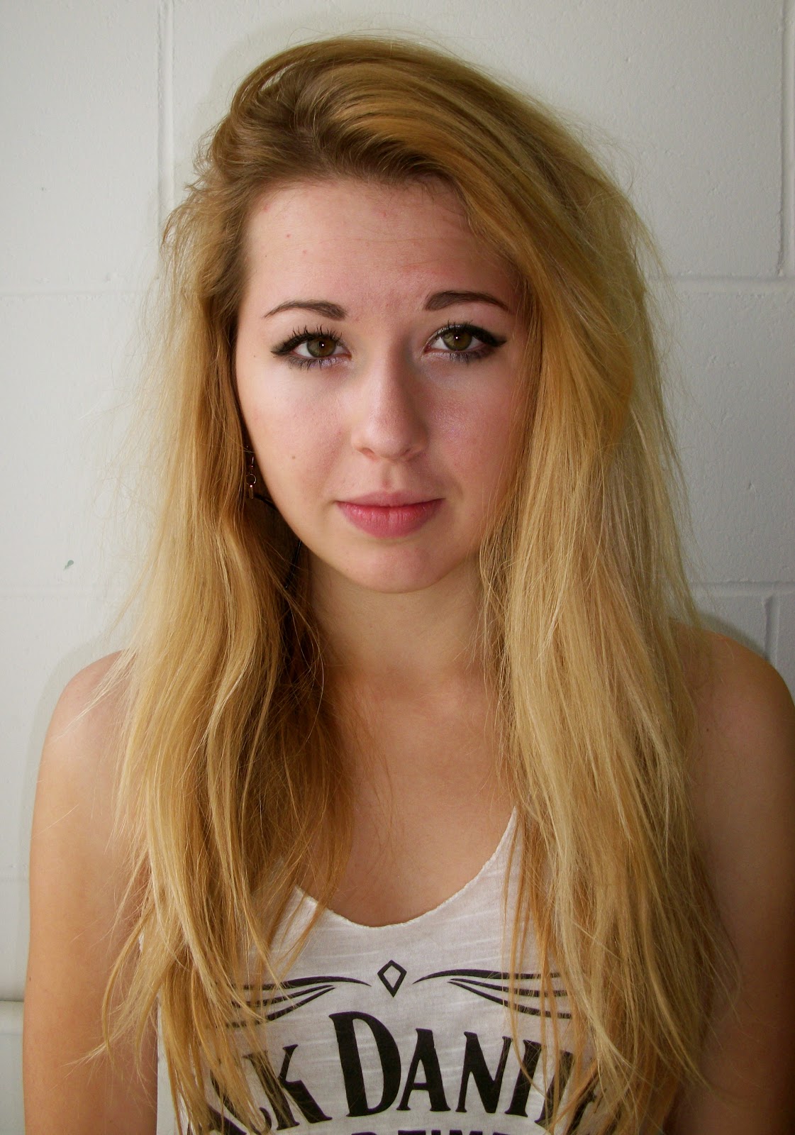
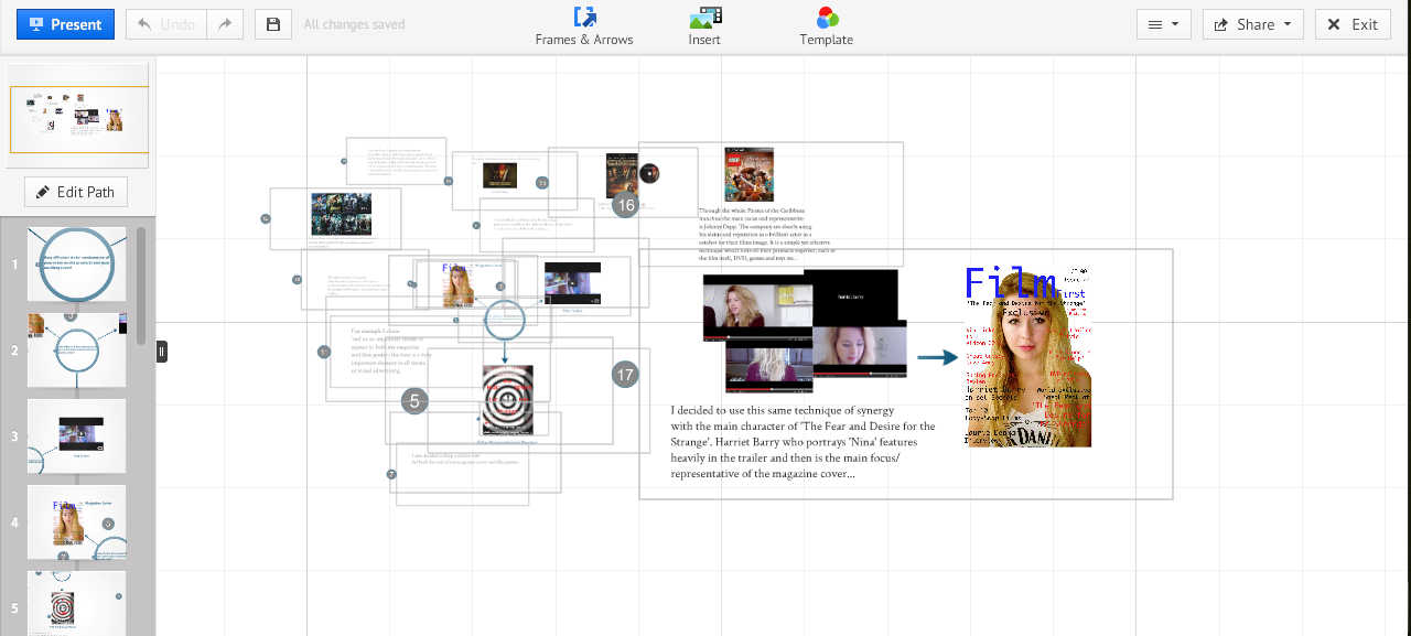
It was very important to create visual links and synergy between my 3 media products in order to sell them as a package effectively. Each act as a platform to the other and as a group make a successful pitch at selling the film as they are effective in attracting audiences. The film poster is the face of the films advertising as it would be distributed online, instead newspapers/ magazines etc. Whereas the magazine cover has one shot at attracting a consumer (the front page) meaning the articles have to be interesting and relate to the film. The magazine would contain more information of the film, anchored by the website shown at the bottom of the film poster. Linking the online sites to the poster. The visual colours of mainly black, white, red and blue being that basis of all three products a visual link is offered. Additionally the face of the brand appears to be 'Nina' as she appears repeatedly in the trailer and is the main image on the magazine. Similarly it was intentional to include the second main actor of the film 'Laurie Denman' as his name appears as an exclusive interview on the magazine cover. Overall all three products are relatable to each other in order to create links for the public to recognise the brand as one. This is a method used by many successful film companies as synergy is essential in effectively advertising within the film industry.
In what ways does your media product use, develop or challenge forms and conventions of real media products? 'The Fear and Desire for the Strange' In research there were many great influences for our final media products. Many of these used forms and conventions of which we noted as very effective and attempted to mirror in our own products. Beginning with the trailer...
The most significant element to our trailer was the body-swap element between the main characters Jay and Nina. In research I found crucial methods in showing distortion of individuals without using high-standard technology of which successful film makers would have access to. Therefore by using video editing software such as iMovie, we created a on-screen sensation of Jay and Nina morphing into one another, signifying the swap....
It is a simple technique of over-lapping images but is very effective in revealing the content and theme of our trailer. The inspiration of this specific shot was of the 2011 film, 'Black Swan' were the main protagonist under the influence of drink and drugs is surrounded by people with her face. In research I discovered that this was in fact a very subtle contribution as not many members of the audience notice it and it is a brilliant connotation to her psychological disorder of schizophrenia.
The definite element of supernatural atmosphere was something I aimed to re-create in our trailer. The sequence from 'Black Swan' has an additional diagetic sound of echoing voices 'Nina, Nina...' over and over to emphasise her loss of control and identity. Therefore the under-lying dark and gloomy atmosphere we created in our trailer through a combination of sounds and images- was formed from the greatly successful thriller 'Black Swan', which also focuses on a loss of self-identity through mental issues. Rather than challenging forms used in 'Black Swan' we developed them to suit our own trailer and made them unique in our presentation. Secondly the basis of the storyline which revolves round 'Body-Swap' was formed by watching with my team members the comedic tale 'Freaky Friday'. This film was fairly light-hearted and aimed at families as it taught vital relationship morals. As the content was humorous it did not like in terms of forms and conventions in the trailer...
However the main elements of the storyline do link as they are both focused on a body-swap theme (however different the content and outcomes are). Therefore we chose to challenge the perhaps 'accepted' forms and conventions which outline all 'body-swap' genres to be light hearted and to have a positive outcome (shown in 'Freaky Friday). To appeal to a slightly different audience we needed forms which would entice our audience; therefore by including drug abuse and suggested violence, rather than family orientated themes.
(Drug scene) A rather conventional element to the story of 'The Fear and Desire for the Strange' was its setting within a school and therefore its main characters to be school students. This was intentional in making them relatable to our target audience who would also be at school. A level of empathy is needed in order to make the trailer more effective and captivating- resulting in our choice to cast the two main characters as a girl and boy (and the subordinate characters as two girls). The final trailer inspiration was from the 1989 film 'Heathers' which was based around a clique of girlfriends at an American High School. Typical of an 80's R rated film it was gritty and shocking- which we wanted to reflect also. The location of a school and a group of friends was developed in our product by modernising the storyline, for example by adding social networking themes (video blogs), sixth form outfits (non-uniform clothes) and a overall 21st century atmosphere.
The presence of violence and alcohol is significant in 'Heathers' however typically of a late 20th century. Films were much more censored in these days and themes of heavy drug abuse was limited, even though the drug-scene rocketed during these years (it was still considered unacceptable on-screen). This form was one we challenged in order to suit our genre of a modern, 21st century, young audience motion picture. Overall in evaluation our film trailer is a slight development of 'Black Swan', in terms of our body-swapping sequences and has a similar feel in terms of atmosphere due to the combination of images and sounds. Secondly the basic idea was originally formed from 'Freaky Friday', a family based drama film with comedic over-tones. We challenged these forms and conventions as they were too typical of our selected genre and in order to entice our young target audience we needed modern elements of which they could relate to. Lastly the film 'Heather's represents the gritty, urban undertones of which 'The Fear and Desire for the Strange' projected in terms of unstable teenage friends with issues. In terms of trailer content and pace, the most influential to our final cut was that of 'Black Swan', as we chose to subtly split the trailer into three sections- an introduction to characters, insight into the storyline and then a climatic end (fast pace)- this was a method shown in the trailer above of 'Black Swan'.
The practice shots were considered quite conventional in retrospect resulting in a more original selection for our final cut. Perhaps the most interesting shot used in our trailer was the birds-eye view of Jay's character in the bath...
It creates the feeling of an unnatural sense of closeness to his deformed facial features, whilst underwater. It shares the suffocating feeling of holding one's breath underwater with the audience as they subconsciously too intake a breath. It is an extremely cleaver and subtle way of linking what is happening on-screen and the audience who are merely watching it- the craft of this shot was to do just that and grip the audiences' attention. Our motive for using this shot was original in motives however the idea arose from a similar scene in 'Black Swan'...
The technique of using a birds-eye view at a close up angle was shared between these two products and although I chose this from seeing 'Black Swan' it gave 'The Fear and Desire for the Strange' a wholly original meaning. The most inspirational existing media product of which we used many forms and conventions and developed a few was 'Black Swan'.
(Black Swan)
(The Fear and Desire for the Strange)
This sequence of shots which shown in 'Black Swan' made a huge impact on our teams ideas in showing someone to be mentally shaken and unstable. The intimacy of a character in the bath assists in creating empathy for the audience. The close-up which established their features is essential in revealing the look of horror and shock; revealing the mood of the trailer overall. We used the same techniques in the series of shots in 'Black Swan' and therefore developed them to suit our body-swap drama trailer.
The Film Poster...
The film poster I created was purposely made to look original and reflect a notion of hypnosis. Synthesising the poster and trailer together a clear sense of mental-distortion is revealed- essential in making the film recognisable to the public. I included the necessary conventions of most film posters, such as the credits on the bottom of the poster, which lists the film company (ClockWork Pictures), the actors, the production team, director and unique website. Including a website on the bottom of film posters is a fairly modern, 21st century convention as it acts as a simple yet effective form of additional advertisement. It is important to keep audiences updated and interested in your film to ensure successful ratings when in the cinema. I deemed a website as a very important factor to include as my target audience of 15-19 are the most indulgent users of the online craze, I found numerous other examples of films using a website on their film posters...
(Website shown at the very top- attracting focus.)
This image is very revealing in the dark, twisted themes of which appear in 'Black Swan'. This film completely challenged the accepted convention of the ballet show Swan Lake and truly shocked its audience. The divide in Nina's character is shown by her identical image- one facing downwards and the other upwards. The is a clear contrast in colouring as the first is bright and vibrant of colour and the other black and white. Both show a disturbing element to Natalie Portman's character- the first poster shows a demonic eye, seeping black liquid over her face. The second shows a juxtaposition of the same person- foreshadowing the storyline of a ballerina finding her dark side (the black swan). Both are very simple ideas but very effective in attracting an audience. The films title is also very simple but bold in standing out against the black background through size, font, colour and positioning.
Here are some existing media products of which were some form of inspiration for my own...
My film poster was aimed to intrigue and appear minimalistic, similar to that of the existing examples above. The design of a black and white spiral is most commonly associated with hypnosis and therefore a mutation of mentality- showing our storyline rather subtly.
Similarly to the examples above it is clear that a bold font and colour is needed to make the title of the film stand out...
The red is a contrasting colour against the black and white background. The placement of each word is intentional to symbolise a swirl of thoughts and feelings, as the hypnosis spiral would essentially spin the words around and digest them (similar to a black hole). The encoder of this would expect the target audience to 'decode' this message of distortion and mental 'out-of-control' feelings.
This tag line is situated at the very top of the film poster- making it a eye-catching and important area of the whole product. Like many film posters (in the past and currently) the names of the main actors in the film are listed in order to credit them and attract audiences (give the film credibility and high expectations). It also is a philosophical question many people face when growing up. Finding one's true identity is a struggle for most people, particularly during the teenage years of your life- relating to our characters and also my target audience! The sentence is addressing the decoder and makes them question it- engaging their interest effectively. Secondly effective posters that exist create a tag-line to give identity to the film and make the audience want to know what the film is about, for example...
This 2010 film uses synergy to make the audience question the content of the film by- 'who is salt?' (meaning they want to find out the answer) and link it to the incredibly successful Hollywood actress Angelina Jolie. (Referring back to my previous analysis of the use of websites, this also applies here).
The Magazine Cover...
This magazine cover for 'Film First' (a company I created) is a 'The Fear and Desire for the Strange' edition. I used a method of synergy by linking the trailer and magazine cover together by using our leading actress of the character 'Nina'. Making a clear link between products, of which many film producers use in order to create a brand image. It is a conventional technique in establishing both the film and the actress and visually links them together. The 'plug' articles I included are all purposely aimed at my teenage target audience, for example- 'Spring Breakers Review, Win Tickets to VidCon' etc.
Also as expected from an exclusive magazine edition, which focusses mainly on a upcoming film, many articles included are related to 'The Fear and Desire for the Strange' franchise. (Harriet Barry on-set secrets, World exclusive sneak peak... Laurie Denman Interview, Top 10 Body-Swap films). Significantly I am establishing the genre of film- even though the content essentially challenges the expected forms and conventions of body-swap films. The language I used also is intentional in appealing to a teenage audience- in other words I avoided a formal, mature tone and went for a informal more conversational choice of words and structure- 'Give-Away'
The articles which do not directly relate to my film is purposely in a less dominant colour on the magazine cover- so the articles which are, over-power the audiences attention. They are also positioned at the bottom (for a lasting effect) and are slightly bigger in font.
A perhaps subtle development/ challenge to usual magazine covers is my choice to include the film distributor company name on the magazine cover next to the film title, in order to credit them and authenticate them ('ClockWork Pictures...') This is not a very common attribute to magazine covers and in my research I found little evidence for this ever occurring, making me question whether this is a gap in the market for a subtle form of extra advertising. As for many companies making a public image is all about presenting yourself in as many positive ways as possible. Therefore by making it clear who is producing the film it gives a bold, important message about 'ClockWork Pictures' and would make it easier to authenticate films in the futures.
The main focus is clearly on the magazines name (masthead), the sub-heading (tag line) 'The Fear and Desire for the Strange' Exclusive and the main cover image. These are the most significant areas of any magazine issue! The font and colour of 'Film First' is extremely large and bold to fill the top section of the cover and to identity the company. The main image is of the 'well-known' actress of who people will associate with the film, I purposely avoided a colour background in order to make the image stand-out along with the articles. The font used for the mast-head is a cinematic/ digital style- relating to the online usage my target audience would empathise with and also gives a new and fresh feel to the cover. It also subtly links to the theme of YouTube video blogs of which are used in my film trailer.
The price and issue number were included after audience feedback suggested that to make the cover more professional and conventional to other covers, I should include one. I situated it at the top as the price is appealing (not expensive) as if a price is hard to find on a magazine, people are less likely to take time to find it and then decide whether or not to buy it.
It is clear that I used current forms and conventions of existing products in my final magazine cover, here are some examples of inspiration for my cover...
All these examples use a female main cover image, a bold title (masthead) and a small amount of articles. Similar language is used, such as 'ultimate, exclusive, explosive, special...' creating a superior feel for the magazine, making the public want to purchase it.
In comparison to my other two media products, my magazine cover does not challenge many current forms and conventions- rather it uses and develops existing methods as explained above.
In terms of drafting a basic storyline we decided not to follow the conventional route that many A-Level media students make- in creating a horror teaser trailer. We felt that this had been done to death and we wanted to be more original. This is where our body-swap theme developed from. By all three of us being huge American school-drama film fans we did some research into the most famous examples. Perhaps the most well-known Lindsey Lohan film, second to 'Mean Girls' which is similar, is 'Freaky Friday'.
This is a family targeted comedy film which follows the body-swap of a Mother and Daughter. We thought this idea was a great one, however we had our own unique ideas as to how to portray our interpretation. Instead of following the same route of a comedy of which numerous other body-swap films take, we decided to focus on the mental confusion and deterioration of identity which we thought would be present if it actually happened to someone. Therefore we challenged the usual forms of a comedy by making dramatic and emotion shots of a character in turmoil, and the resort to drugs sequence in order to deal with the ordeal.
The sound used also added to the 'thriller/ dark' mood to the trailer. This included the dramatic narrative of Jay expressing how he can't 'explain what's happening'.
Overall each media product (teaser trailer, film poster and magazine cover) have used, developed and challenged forms of existing media products in order to make my project successful in its aims.