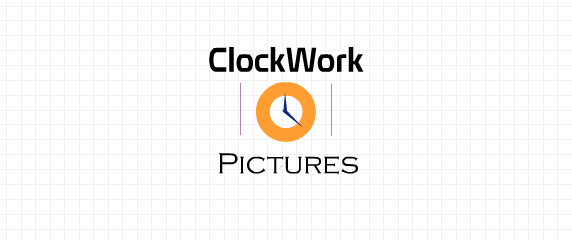
Here are the three designs I have created to be the 'ClockWork Pictures' Logo. For each I decided upon a symbol of time to appear in all, to obviously cater to the 'Clock' element of name, making the public associate the brand and the logo together (more memorable). They also are visually cinematic and look like a digital brand and therefore I believe they suit the image of a film distributor. However I could not decide conclusively between the three and needed some assisted feedback from external sources to help with the decision. I asked five different people from a range of ages...
''I personally really like the first logo as it fits together nicely and is enjoyable to look at compared to the others that are quite dull compared to it''. Olivia Bates, 17
''I vote for the third option because it remind me of the digital world and therefore films, music and the internet so I think it would suit the business image''. Michael Andrew, 40
''I would like to see the first logo as your final design as the colours go very well together and it appears very professional''. Emily McCarthy, 18
''The second logo looks the best to me, I really like the difference in fonts and the image of a clock in the certain- it looks smart''. Sam Robson, 19
''I don't like the last one very much because it looks like it is for a video game and the middle one is too boring, I really like the first logo''. Harrison Andrew, 12
(The final design the of 'ClockWork Pictures' logo)


Simple and elegant! Love it! Thanks for sharing this.
ReplyDeleteWebsite designing Company in lucknow